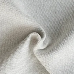
CLOUD DANCER 11-4201
Cloud Dancer is the trend colour of 2026! Pantone has chosen Cloud Dancer, a soft, neutral white, as the trend colour of the year. This shade represents calm, clarity and a creative new beginning.
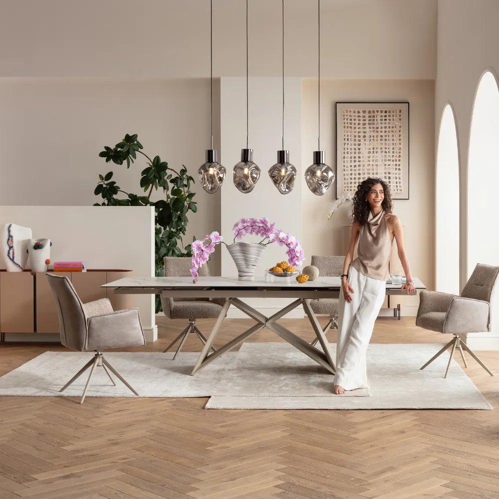
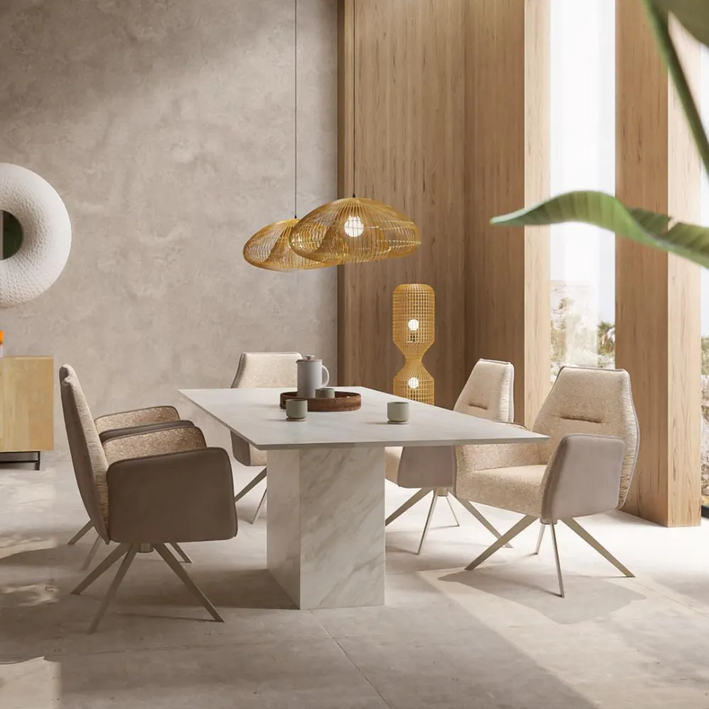
STYLING YOUR HOME WITH THE NEW TREND COLOUR
Discover how to combine KARE furniture with Cloud Dancer and arrange it in a stylish way to create a harmonious and energising atmosphere in your space.
Only 6 available
-18%


x90cm")
Only 10 available
-18%


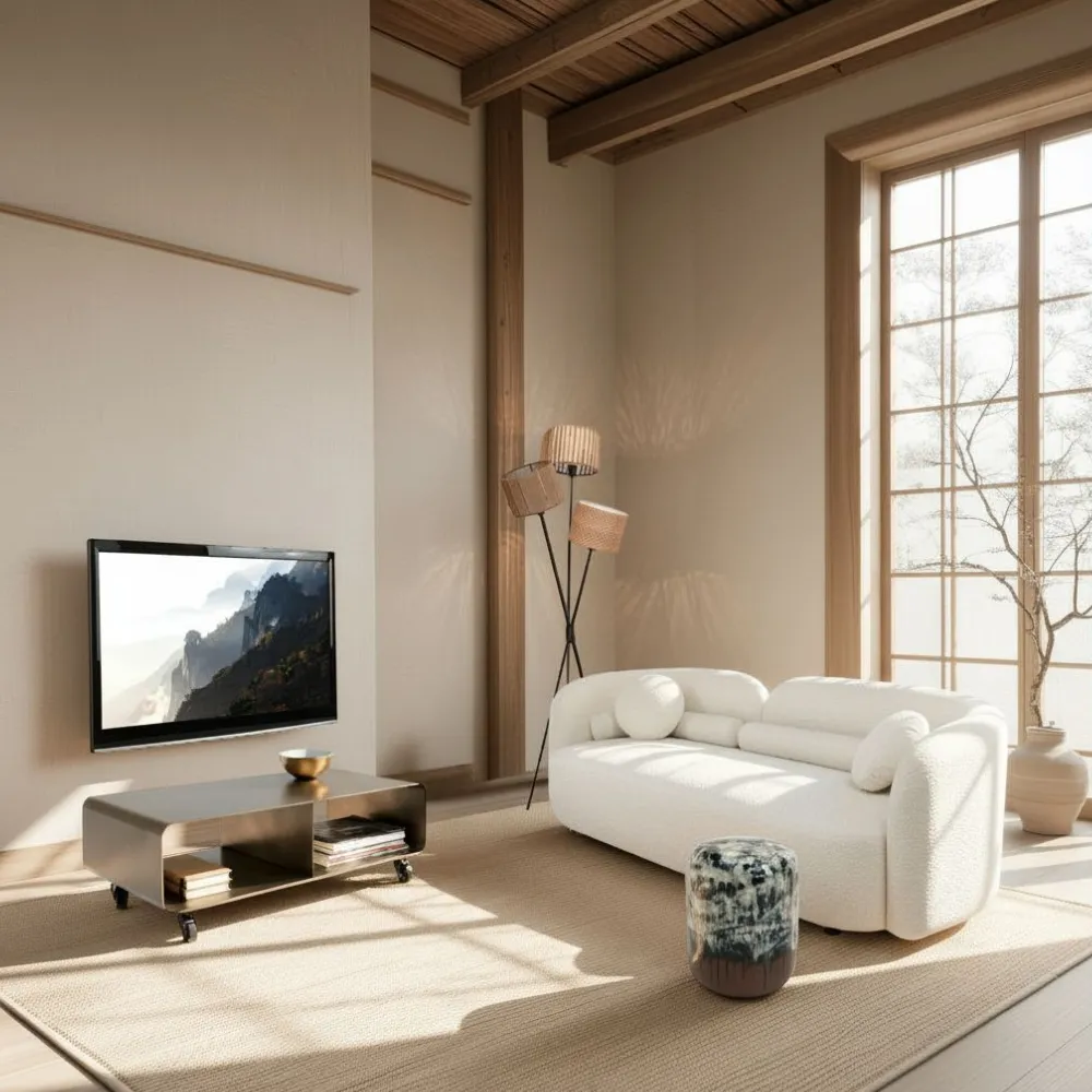
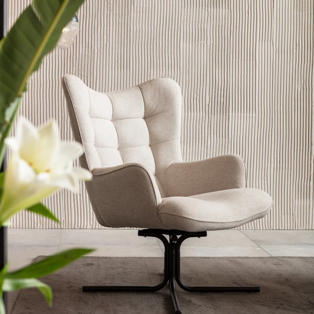
NO SCANDI LOOK WITHOUT CLOUD DANCER


Only 1 available
-18%
IN STOCK: 1


> 99 available
-12%
IN STOCK: 1


Only 1 available
-15%
IN STOCK: 4


WE PROUDLY PRESENT – THE PANTONE COLOR OF THE YEAR 2026: CLOUD DANCER
WHAT IS PANTONE AND WHAT ROLE DOES THE PANTONE COLOR OF THE YEAR 2026 CLOUD DANCER PLAY IN INTERIOR DESIGN AND FURNITURE SELECTION?
The Pantone Color of the Year is determined through a careful, months-long selection process that deeply analyzes global cultural, social, economic, and political developments. Here is an overview of the selection process and the factors that play a role:
The Pantone Color of the Year 2026: Cloud Dancer
The Pantone Color of the Year 2026 is named Cloud Dancer and is a sublime, light hue positioned between white, cream, and a soft greige. This color feels airy, delicate, and elegant—like a veil of light or a fine layer of clouds. Cloud Dancer is neutral yet full of character, offering a modern clarity that makes spaces appear harmonious, spacious, and timeless.
The significance of Cloud Dancer for interior design and furniture selection
Airy and elegant atmosphere
Cloud Dancer conveys lightness, calm, and purity. As the 2026 trend color, it is ideal for living spaces where a clear, relaxing, yet stylish atmosphere is desired. Because this color is subtle yet present, it works perfectly in living rooms, bedrooms, home offices, or open living areas where harmony and structure are key.
Versatility in combinations
Cloud Dancer can be combined in many ways—especially with natural tones such as warm beige, light sand, taupe, sage green, or soft grey nuances. As the 2026 trend color, it is particularly harmonious alongside wood surfaces, natural stone, or textiles like linen and cotton. Modern accents in black, brass, or chrome also complement this elegant creamy shade beautifully, offering a stylish, contemporary contrast.
Enhancing textures and materials
This color is excellent for highlighting textures and materials. Furniture or accessories in Cloud Dancer set subtle yet high-quality accents. Velvet, wool, linen, or textured wood pair exceptionally well with this trend color. A Cloud Dancer sofa appears elegantly minimalistic, while chairs or sideboards in this shade bring a calm, luxurious feel to the room.
Timelessness and durability
Cloud Dancer is a classic, timeless color that will remain modern far beyond 2026. Unlike strong trend colors that may quickly fade from popularity, Cloud Dancer provides a long-lasting foundation for furniture and interior pieces. Choosing this 2026 trend color means investing in a visual world that stays stylish for many years.
Brightness and comfort
This trend color creates an inviting, bright atmosphere. Furniture in Cloud Dancer—whether sofas, beds, cabinets, or sideboards—brings a sense of spaciousness and clarity. It reflects light remarkably well, making it ideal for smaller rooms or spaces where an open, calming effect is desired. Cloud Dancer supports a feeling of comfort without appearing overwhelming.
Color psychology
Light, neutral tones like Cloud Dancer often represent purity, harmony, and balance. They promote concentration, calmness, and a sense of order. As the 2026 trend color, Cloud Dancer helps rooms feel positive, friendly, and balanced. Residents feel relaxed, clear-minded, and welcome in an environment with this soft hue.
Conclusion: Cloud Dancer as Pantone Color of the Year 2026
Cloud Dancer as the Pantone Color of the Year 2026 combines modern clarity with timeless elegance. Anyone seeking a bright, harmonious, and high-quality interior atmosphere will find this color an excellent choice. Furniture in Cloud Dancer appears modern, durable, and versatile—ideal for a home that radiates peace, style, and ease.
HOW IS THE PANTONE COLOR OF THE YEAR SELECTED?
The Pantone Color of the Year is determined through a careful, months-long selection process that closely examines global cultural, social, economic, and political developments. Here is an overview of the selection process and the factors that play a role:
1. Global observation and research
Pantone begins with an extensive analysis of global trends. The company studies various industries and cultural movements to understand which colors could play a significant role. Many different sources are considered:
Fashion and design: Pantone follows the latest collections of fashion designers, furniture creators, and product designers to see which tones dominate runways and showrooms.
Art and culture: Art, music, film, and literature often reveal preferences for certain colors that reflect the cultural climate.
Politics and economy: Political events, economic trends, and social movements also influence color choice and perception.
Technology and innovation: New technologies and the way people engage with digital media also play a role in shaping color trends.
2. Color as a response to collective moods
The Pantone Color of the Year is often chosen in response to the general feelings and global mood at a given time. The color acts as a mirror of the cultural atmosphere and expresses a sentiment or attitude present in society.
Example: After the 2008 financial crisis, the calming Turquoise was chosen as the 2010 Color of the Year to symbolize hope and renewal. In 2020, Classic Blue was selected to convey stability and tranquility during uncertain times.
3. The role of the Pantone Color Institute
The Pantone Color Institute is the expert team that leads the selection process. It consists of designers, color specialists, and trend analysts who study the global color and design landscape. They attend design fairs, collect data from various fields, and examine the psychology of color to understand how colors influence perception and behavior.
4. Scientific data and color psychology
Pantone also considers scientific research on color psychology to ensure that the chosen color has a meaningful emotional impact. The effect of colors on human behavior is a key part of the process, as the Color of the Year often aims to evoke a targeted emotional response—be it energy, calm, vision, or connection.
5. Announcement and launch
Once the Color of the Year is selected, Pantone announces the decision publicly—usually in December of the previous year. The color is introduced through an extensive marketing campaign highlighting its psychological effect, uses, and cultural context. Pantone also provides color codes that enable designers and manufacturers to reproduce the exact shade in their products and designs.
Summary
The Pantone Color of the Year is chosen through a comprehensive process rooted in global research, cultural observation, and the analysis of social trends. The decision involves not only visual impact but also emotional significance and cultural relevance. Pantone draws from a variety of disciplines—including fashion, art, technology, and social movements—to select a color that reflects the spirit of the upcoming year.
WHAT KIND OF COLOR IS CLOUD DANCER ACTUALLY?
What kind of color is Cloud Dancer actually?
Cloud Dancer is an exceptionally elegant, soft, and versatile shade situated between pure white, creamy off-white, delicate beige, and a modern touch of greige. This tone is bright, gentle, yet full of character — a color that immediately conveys serenity, clarity, and naturalness. Cloud Dancer feels like a fine veil of light: pure, airy, refined, and subtle without ever appearing dull. This unique blend makes Cloud Dancer one of the most interesting and popular shades in modern interior and furniture design.
The color spectrum of Cloud Dancer: between white, cream, beige, and greige
A sublime white
The foundation of Cloud Dancer is a luminous bright white that does not appear cold or clinical. This element brings openness and spaciousness to a room — perfect for anyone seeking a calm, minimalist environment that still feels warm and inviting.
Creamy warmth
A gentle creamy touch gives Cloud Dancer a soft warmth. This makes the color feel harmonious and comforting, creating a pleasant and relaxing atmosphere even across large surfaces.
Subtle beige
A light hint of beige adds an earthy, natural nuance. Beige represents harmony, warmth, and grounding — qualities that make Cloud Dancer a reliable base color for interior spaces. Rooms feel balanced and comfortably calm as a result.
A modern greige character
A hint of greige gives Cloud Dancer a contemporary, versatile flair — neither fully warm nor cool. This duality makes it adaptable across various interior styles and easy to pair with existing color palettes. It is neutral but never bland, serving as a flexible foundation for modern design concepts.
The effect of Cloud Dancer in a room
Cloud Dancer reflects light exceptionally well, creating a sense of brightness and lightness. Rooms painted or furnished in this color feel more spacious, clearer, and airier. The combination of white, cream, and greige produces a harmonizing effect that soothes the eye and balances the overall visual impression.
At the same time, Cloud Dancer carries an elegant, purist aura. The color feels premium, modern, and refined without being intrusive. It works beautifully in clean, structured styles like Minimalism, Scandinavian, or Japandi, but also harmonizes well with cozy natural interiors.
Although Cloud Dancer brings warmth, it still appears light and effortless. Unlike many strong beige tones, it doesn’t weigh down a space but instead adds a gentle, soft atmosphere that feels cozy without becoming overwhelming.
The significance of Cloud Dancer in furniture design
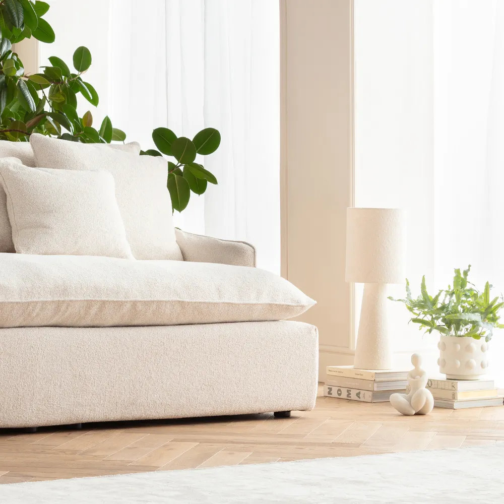
As an upholstery color, Cloud Dancer unfolds a luxurious yet natural effect. Sofas, beds, or armchairs in this shade feel soft, inviting, and timelessly elegant. Fabrics like bouclé, linen, velvet, or wool complement Cloud Dancer perfectly, giving furniture a serene and modern presence.
The color also works wonderfully for cabinets, sideboards, and dressers. Furniture in Cloud Dancer introduces clarity, order, and lightness into a room. Matte finishes or open-pored wood textures further enhance its refined, architectural character.
Cloud Dancer pairs beautifully with natural materials such as light or untreated wood, stone, marble, or terrazzo. Metal accents in black, gold, or chrome add modern definition and contrast. Textiles in wool, cotton, or bouclé amplify the shade’s elegant and calming effect.
Another major advantage of Cloud Dancer is its timelessness. Furniture in this color transcends trends and can adapt to different interior styles over many years. The shade feels modern today and will continue to do so in the future. This makes Cloud Dancer an excellent choice for long-term, high-quality furniture investments.
Furthermore, Cloud Dancer offers tremendous design freedom. It pairs equally well with warm earth tones like sand, taupe, or terracotta, and with cooler shades such as grey, sage, or soft pastels. Even bold accents like black blend harmoniously, adding depth and structure to the overall interior concept.
Conclusion: Cloud Dancer — the new lightness in interior design
Cloud Dancer is a color that conveys calm, clarity, and elegance. It is bright, warm, and neutral at the same time, offering countless possibilities for personalized interior concepts. Furniture in Cloud Dancer brings a modern, natural, and stylish atmosphere to any home.
Whether used on walls, as an accent, or across large furniture pieces — Cloud Dancer brings light, ease, and timeless elegance into any space.
Cloud Dancer is an exceptionally elegant, soft, and versatile shade situated between pure white, creamy off-white, delicate beige, and a modern touch of greige. This tone is bright, gentle, yet full of character — a color that immediately conveys serenity, clarity, and naturalness. Cloud Dancer feels like a fine veil of light: pure, airy, refined, and subtle without ever appearing dull. This unique blend makes Cloud Dancer one of the most interesting and popular shades in modern interior and furniture design.
The color spectrum of Cloud Dancer: between white, cream, beige, and greige
A sublime white
The foundation of Cloud Dancer is a luminous bright white that does not appear cold or clinical. This element brings openness and spaciousness to a room — perfect for anyone seeking a calm, minimalist environment that still feels warm and inviting.
Creamy warmth
A gentle creamy touch gives Cloud Dancer a soft warmth. This makes the color feel harmonious and comforting, creating a pleasant and relaxing atmosphere even across large surfaces.
Subtle beige
A light hint of beige adds an earthy, natural nuance. Beige represents harmony, warmth, and grounding — qualities that make Cloud Dancer a reliable base color for interior spaces. Rooms feel balanced and comfortably calm as a result.
A modern greige character
A hint of greige gives Cloud Dancer a contemporary, versatile flair — neither fully warm nor cool. This duality makes it adaptable across various interior styles and easy to pair with existing color palettes. It is neutral but never bland, serving as a flexible foundation for modern design concepts.
The effect of Cloud Dancer in a room
Cloud Dancer reflects light exceptionally well, creating a sense of brightness and lightness. Rooms painted or furnished in this color feel more spacious, clearer, and airier. The combination of white, cream, and greige produces a harmonizing effect that soothes the eye and balances the overall visual impression.
At the same time, Cloud Dancer carries an elegant, purist aura. The color feels premium, modern, and refined without being intrusive. It works beautifully in clean, structured styles like Minimalism, Scandinavian, or Japandi, but also harmonizes well with cozy natural interiors.
Although Cloud Dancer brings warmth, it still appears light and effortless. Unlike many strong beige tones, it doesn’t weigh down a space but instead adds a gentle, soft atmosphere that feels cozy without becoming overwhelming.
The significance of Cloud Dancer in furniture design
As an upholstery color, Cloud Dancer unfolds a luxurious yet natural effect. Sofas, beds, or armchairs in this shade feel soft, inviting, and timelessly elegant. Fabrics like bouclé, linen, velvet, or wool complement Cloud Dancer perfectly, giving furniture a serene and modern presence.
The color also works wonderfully for cabinets, sideboards, and dressers. Furniture in Cloud Dancer introduces clarity, order, and lightness into a room. Matte finishes or open-pored wood textures further enhance its refined, architectural character.
Cloud Dancer pairs beautifully with natural materials such as light or untreated wood, stone, marble, or terrazzo. Metal accents in black, gold, or chrome add modern definition and contrast. Textiles in wool, cotton, or bouclé amplify the shade’s elegant and calming effect.
Another major advantage of Cloud Dancer is its timelessness. Furniture in this color transcends trends and can adapt to different interior styles over many years. The shade feels modern today and will continue to do so in the future. This makes Cloud Dancer an excellent choice for long-term, high-quality furniture investments.
Furthermore, Cloud Dancer offers tremendous design freedom. It pairs equally well with warm earth tones like sand, taupe, or terracotta, and with cooler shades such as grey, sage, or soft pastels. Even bold accents like black blend harmoniously, adding depth and structure to the overall interior concept.
Conclusion: Cloud Dancer — the new lightness in interior design
Cloud Dancer is a color that conveys calm, clarity, and elegance. It is bright, warm, and neutral at the same time, offering countless possibilities for personalized interior concepts. Furniture in Cloud Dancer brings a modern, natural, and stylish atmosphere to any home.
Whether used on walls, as an accent, or across large furniture pieces — Cloud Dancer brings light, ease, and timeless elegance into any space.
WHICH FURNITURE AND INTERIOR STYLES GO ESPECIALLY WELL WITH THE NEW TREND COLOR CLOUD DANCER IN 2026?
Which furniture and interior styles go especially well with the new trend color Cloud Dancer in 2026?
The trend color Cloud Dancer will play a central role in interior design in 2026. With its refined white, creamy undertone, and subtle blend of beige and greige, it opens up countless possibilities to style your home in a modern, bright, and timeless way. Cloud Dancer becomes particularly exciting when combined with the leading interior styles of 2026. It brings calm, elegance, and lightness — while fitting seamlessly into a variety of design approaches.
Below, you will discover the five major interior trends of 2026 that harmonize exceptionally well with Cloud Dancer — and which furniture pieces best highlight this trend color.
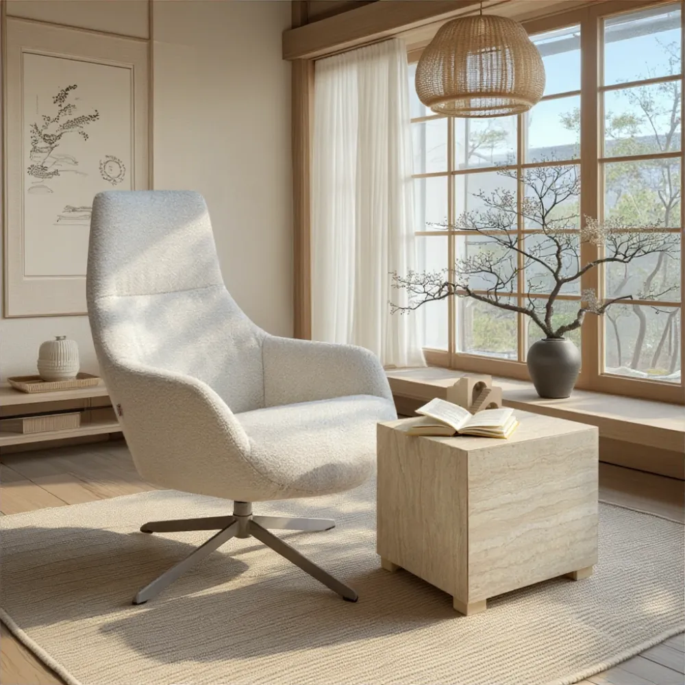
1. Japandi 2.0 – Minimalist naturalness meets warm elegance
Japandi will remain one of the strongest interior trends in 2026. The style merges Japanese serenity with Scandinavian naturalness. Cloud Dancer is the perfect match because it provides a soft, unobtrusive base.
In Japandi interiors, furniture made from light, untreated wood — such as oak or ash — is ideal. Simple sideboards, low-profile beds, or minimalist sofas in Cloud Dancer create a harmonious atmosphere. The light, creamy undertones introduce a grounded calmness typical of the Japandi aesthetic. Complement the look with linen textiles, ceramics, and clean lines.
2. Modern Organic – Natural materials in a timeless blend
The “Modern Organic” trend will dominate 2026. It celebrates organic shapes, earthy tones, and authentic natural materials. Cloud Dancer enhances this style perfectly by highlighting the warmth and texture of wood, stone, rattan, and woven textiles.
Choose furniture with soft curves — rounded sofas, organic dining tables, or sculptural armchairs. In Cloud Dancer, these pieces appear light, soft, and harmonious. Paired with travertine, natural stone, wickerwork, or bouclé, the result is a relaxed yet contemporary interior. Cloud Dancer acts as the unifying element, infusing the space with brightness and tranquility.
3. Soft-Luxury Minimalism – Clarity without coldness
In 2026, minimalism evolves into something warmer and more luxurious. Instead of strict lines, the focus shifts toward “soft luxury”: high-quality materials, gentle curves, and understated colors. Cloud Dancer is ideal for emphasizing this refined form of minimalism.
Opt for furniture with smooth, elegant silhouettes: a generous Cloud Dancer sofa, an upholstered bed, or an off-white sideboard. Combined with brass, chrome, or premium matte finishes, the result is a luxurious yet understated aesthetic. Cloud Dancer delivers the essential calm and brightness needed to balance the soft-minimalist look.
4. Scandinavian Calm – Bright clarity and cozy atmosphere
The Scandinavian style remains a classic in 2026 but increasingly evolves toward “Scandinavian Calm.” This direction focuses on bright rooms, soft textures, and functional furniture. Cloud Dancer harmonizes beautifully with light woods, woven fabrics, and simple, modern forms.
Furniture like lightweight wooden chairs, narrow bookcases, minimalist sofas, or round coffee tables in Cloud Dancer reinforces the Scandinavian feeling of ease. The color appears friendly, open, and bright — perfect for anyone seeking a relaxed and effortless home. Cloud Dancer also works wonderfully for textiles such as rugs, throws, and curtains in Scandi settings.
5. Contemporary Elegance – Modern clarity with polished accents
In 2026, contemporary interiors lean increasingly toward elegance: clean architecture, high-quality surfaces, and refined color palettes. Cloud Dancer integrates seamlessly because it is neutral enough to support the style while distinct enough to highlight luxurious accents.
Choose furniture that combines modern surfaces with refined details — for example, wood-veneer sideboards, velvet sofas, or beds with upholstered headboards. Cloud Dancer acts like a premium canvas that allows marble, glass, metal, or deep accent colors like charcoal or espresso to shine. This creates a sophisticated, timeless aesthetic.
Conclusion: Cloud Dancer is the perfect trend color of 2026 for modern furniture and versatile interior styles
Whether Japandi, Modern Organic, soft-minimalist, Scandinavian, or elegant-contemporary — Cloud Dancer fits into virtually every major interior trend of 2026. The color brings calm, brightness, and timeless elegance into your home, while making furniture appear premium and modern. It offers the ideal foundation to combine various styles flexibly while maintaining a harmonious overall aesthetic.
If you want to style your home in 2026 in a modern, bright, and elegant way, Cloud Dancer is the perfect choice.
The trend color Cloud Dancer will play a central role in interior design in 2026. With its refined white, creamy undertone, and subtle blend of beige and greige, it opens up countless possibilities to style your home in a modern, bright, and timeless way. Cloud Dancer becomes particularly exciting when combined with the leading interior styles of 2026. It brings calm, elegance, and lightness — while fitting seamlessly into a variety of design approaches.
Below, you will discover the five major interior trends of 2026 that harmonize exceptionally well with Cloud Dancer — and which furniture pieces best highlight this trend color.
1. Japandi 2.0 – Minimalist naturalness meets warm elegance
Japandi will remain one of the strongest interior trends in 2026. The style merges Japanese serenity with Scandinavian naturalness. Cloud Dancer is the perfect match because it provides a soft, unobtrusive base.
In Japandi interiors, furniture made from light, untreated wood — such as oak or ash — is ideal. Simple sideboards, low-profile beds, or minimalist sofas in Cloud Dancer create a harmonious atmosphere. The light, creamy undertones introduce a grounded calmness typical of the Japandi aesthetic. Complement the look with linen textiles, ceramics, and clean lines.
2. Modern Organic – Natural materials in a timeless blend
The “Modern Organic” trend will dominate 2026. It celebrates organic shapes, earthy tones, and authentic natural materials. Cloud Dancer enhances this style perfectly by highlighting the warmth and texture of wood, stone, rattan, and woven textiles.
Choose furniture with soft curves — rounded sofas, organic dining tables, or sculptural armchairs. In Cloud Dancer, these pieces appear light, soft, and harmonious. Paired with travertine, natural stone, wickerwork, or bouclé, the result is a relaxed yet contemporary interior. Cloud Dancer acts as the unifying element, infusing the space with brightness and tranquility.
3. Soft-Luxury Minimalism – Clarity without coldness
In 2026, minimalism evolves into something warmer and more luxurious. Instead of strict lines, the focus shifts toward “soft luxury”: high-quality materials, gentle curves, and understated colors. Cloud Dancer is ideal for emphasizing this refined form of minimalism.
Opt for furniture with smooth, elegant silhouettes: a generous Cloud Dancer sofa, an upholstered bed, or an off-white sideboard. Combined with brass, chrome, or premium matte finishes, the result is a luxurious yet understated aesthetic. Cloud Dancer delivers the essential calm and brightness needed to balance the soft-minimalist look.
4. Scandinavian Calm – Bright clarity and cozy atmosphere
The Scandinavian style remains a classic in 2026 but increasingly evolves toward “Scandinavian Calm.” This direction focuses on bright rooms, soft textures, and functional furniture. Cloud Dancer harmonizes beautifully with light woods, woven fabrics, and simple, modern forms.
Furniture like lightweight wooden chairs, narrow bookcases, minimalist sofas, or round coffee tables in Cloud Dancer reinforces the Scandinavian feeling of ease. The color appears friendly, open, and bright — perfect for anyone seeking a relaxed and effortless home. Cloud Dancer also works wonderfully for textiles such as rugs, throws, and curtains in Scandi settings.
5. Contemporary Elegance – Modern clarity with polished accents
In 2026, contemporary interiors lean increasingly toward elegance: clean architecture, high-quality surfaces, and refined color palettes. Cloud Dancer integrates seamlessly because it is neutral enough to support the style while distinct enough to highlight luxurious accents.
Choose furniture that combines modern surfaces with refined details — for example, wood-veneer sideboards, velvet sofas, or beds with upholstered headboards. Cloud Dancer acts like a premium canvas that allows marble, glass, metal, or deep accent colors like charcoal or espresso to shine. This creates a sophisticated, timeless aesthetic.
Conclusion: Cloud Dancer is the perfect trend color of 2026 for modern furniture and versatile interior styles
Whether Japandi, Modern Organic, soft-minimalist, Scandinavian, or elegant-contemporary — Cloud Dancer fits into virtually every major interior trend of 2026. The color brings calm, brightness, and timeless elegance into your home, while making furniture appear premium and modern. It offers the ideal foundation to combine various styles flexibly while maintaining a harmonious overall aesthetic.
If you want to style your home in 2026 in a modern, bright, and elegant way, Cloud Dancer is the perfect choice.
WHICH DECOR ELEMENTS AND DECOR OBJECTS CAN BE COMBINED PARTICULARLY WELL WITH THE PANTONE COLOR CLOUD DANCER?
Which decor elements and decor objects can be combined particularly well with the Pantone color Cloud Dancer?
The Pantone trend color Cloud Dancer opens up new possibilities in 2026 to design your home in a bright, modern, and stylish way. This delicate blend of refined white, creamy undertones, and soft beige-greige notes makes Cloud Dancer an ideal base color for a wide range of decorations. Whether you want to create subtle, natural, or elegant highlights — Cloud Dancer always provides harmony and balance.
Below, you will find which decor objects, materials, and accessories pair especially well with Cloud Dancer in 2026.
Natural materials: Wood, stone & woven textures
Decor made from natural materials harmonizes beautifully with Cloud Dancer because the color gently emphasizes their organic character. Bowls, vases, trays, and small sculptures made of light woods such as oak, birch, or ash look particularly decorative. They add warmth to the room without compromising the lightness of the trend color.
Natural stone, travertine, and sandstone also pair exceptionally well with Cloud Dancer. Candleholders, sculptures, or decorative bowls made of stone create elegant, calm accents and enhance the natural depth of the color. In addition, rattan, wicker, or bamboo add a cozy, handcrafted touch.
Glass, ceramic & porcelain: Subtle elegance
Glass and ceramic decorations are especially suitable for complementing Cloud Dancer in a refined way. Vases, LED lights, lanterns, or tabletop decor made from clear, frosted, or tinted glass produce gentle reflections that pick up and amplify the color’s brightness.
Ceramic and porcelain pieces in matte, natural tones — such as cream, sand, stoneware, or soft greige — reinforce the calm, pure look of the trend color. On consoles, dining tables, or windowsills, these pieces appear modern, restrained, and warmly elegant.
Textile decor elements: Softness and texture
Cloud Dancer shines especially when combined with textile accessories. Cushions, blankets, throws, and rugs made from linen, cotton, wool, or bouclé create a soft, inviting atmosphere. They are perfect for adding depth and comfort to your home.
Textured fabrics will be particularly trendy in 2026: chunky knits, bouclé, and woven structures add understated highlights and enhance the natural feel of Cloud Dancer. Lightweight curtains in off-white or greige tones allow the color to filter softly through the room, increasing brightness and airiness.
Metallic accents: Elegance and modernity
Metallic decor is a key element of 2026 and adds a modern, luxurious touch to Cloud Dancer. Black metal creates a clean, urban contrast, while brass introduces a warm, elegant accent. Both variants stand out without overwhelming the gentle character of the trend color.
Chrome, stainless steel, and smoked metal also work beautifully and enhance Cloud Dancer’s modern elegance. Whether in candleholders, picture frames, decorative objects, or lamps — metallic accents paired with Cloud Dancer create a stylish and balanced look.
Plants & botanical elements: Natural vibrancy
Green accents bring Cloud Dancer to life. Large indoor plants, soft dried flowers, or fresh foliage create the perfect counterpart to the creamy, calm tones. Planters in terracotta or stone work especially well, while white or black ceramic pots offer a modern edge.
Arrangements made of pampas grass, eucalyptus, or natural branches beautifully complement Cloud Dancer’s softness and add organic highlights that feel both serene and lively.
Statement objects & modern art
Timeless art pieces, minimalist sculptures, or abstract paintings pair wonderfully with Cloud Dancer. The color acts as a quiet backdrop that allows linear artworks, anthracite details, or nude-toned compositions to stand out. A large wall piece in greige or a sculptural ceramic object can complete your interior and blend harmoniously with Cloud Dancer.
Conclusion: Cloud Dancer can be styled in many elegant and versatile ways in 2026
Decor elements made of wood, stone, ceramic, textiles, or metal achieve an exceptionally harmonious effect when combined with Cloud Dancer. The color brings calm and elegance into your home and allows both minimalistic and expressive decor to shine. Natural materials, soft textures, and modern accents enhance Cloud Dancer perfectly and create a bright, contemporary, and harmonious interior.
IS THE PANTONE TREND COLOR A TIMELESS CLASSIC OR JUST A SHORT-LIVED TREND? – CLOUD DANCER 2026 IN FOCUS
Is the Pantone Trend Color a timeless classic or just a short-lived trend? – Cloud Dancer 2026 in focus
Every year, Pantone announces a new Trend Color — often a shade that reflects the spirit of the times and strongly influences creative industries. But not every color becomes a classic. With Cloud Dancer, the Pantone Trend Color for 2026, the question becomes especially intriguing: Is it merely a fleeting fashion trend, or a hue with long-term significance?
The answer is surprisingly clear — Cloud Dancer carries all the qualities needed to evolve into much more than just a one-year trend.
Cloud Dancer 2026: A trend color with strong timeless potential
Cloud Dancer is not defined by intensity, boldness, or extravagance, but by its subtle elegance. Combining refined white, gentle cream, soft beige, and contemporary greige notes, the color belongs to a neutral and natural palette that has dominated interior design for decades.
This well-balanced composition gives Cloud Dancer a timeless foundation that will remain relevant far beyond 2026.
Why Cloud Dancer is more than a short-term trend
1. Neutral colors remain popular long-term
Neutrals such as white, off-white, beige, and greige have consistently been among the most in-demand tones in furniture and interior design. Cloud Dancer combines all of these elements in a modern, refined way. As a result, the color will not appear outdated quickly — it remains fresh, versatile, and contemporary.
2. Highly flexible — now and in the future
Cloud Dancer can be combined with nearly any material or color: natural woods, stone, metal, earthy tones, or modern black accents. This exceptional versatility ensures the color adapts effortlessly to future trends as well. Even years from now, Cloud Dancer will harmonize with upcoming design directions.
3. Ideal for long-lasting furniture and design decisions
Because Cloud Dancer is not tied to a specific aesthetic or a short-lived trend phase, it is perfect for high-quality furniture meant to last. Unlike bold trend colors that may appear dated within a few seasons, Cloud Dancer stays elegant and unobtrusively stylish for many years.
4. A balance of zeitgeist and timeless design
Cloud Dancer aligns with the modern desire for calm, naturalness, and brightness. At the same time, the color conveys a timeless clarity associated with classic interior aesthetics. It fits perfectly into popular trends like Japandi, Modern Organic, or Scandinavian Calm — yet stays neutral enough to integrate easily into any future style.
So, is Cloud Dancer a classic? — Strong indication: Yes
Cloud Dancer 2026 possesses everything a trend color needs to become a long-term favorite:
Elegance, neutrality, naturalness, and modernity. It does not rely on seasonal hype and is neither overwhelming nor overly specific — instead, it provides the ideal foundation for timeless interior concepts.
This makes Cloud Dancer one of the Pantone colors with the potential to evolve from a one-year trend into a true classic. Choosing Cloud Dancer for furniture, walls, or decorative elements in 2026 means investing in a look that will remain stylish and relevant for many years.
Conclusion: Cloud Dancer is a trend color with a future
Cloud Dancer is far more than a short-lived color trend. It is a modern, calm, and timeless shade with long-lasting appeal. It complements current design trends while remaining neutral enough to stay relevant in the years ahead.
If you’re looking for a color that feels contemporary yet classic, Cloud Dancer is the perfect choice — in 2026 and beyond.
A BRIEF OVERVIEW – WHAT WERE THE PANTONE TREND COLORS OF RECENT YEARS?
A brief overview – What were the Pantone Trend Colors of recent years?
Pantone Trend Color 2015 – Marsala
Marsala was a surprisingly profound choice in 2015. The warm, earthy red-brown tone, reminiscent of the wine of the same name, blended elegance with grounded naturalness. Marsala quickly became popular in fashion, cosmetics, and interior design. In home décor, it introduced powerful yet natural warmth into living spaces and paired beautifully with wood, bronze, and textured fabrics like velvet or wool. Marsala felt like a bridge between tradition and modern luxury.
Pantone Trend Colors 2016 – Rose Quartz & Serenity
In 2016, for the first time, Pantone selected two colors: Rose Quartz, a gentle pink, and Serenity, a serene sky blue. Together, they symbolized calm, balance, and emotional stability. The soft pastel duo reflected a growing desire for peace in an increasingly hectic world. In interior design, the combination was particularly popular in bedrooms, children’s rooms, and soft Scandinavian looks, creating spaces full of harmony and lightness.
Pantone Trend Color 2017 – Greenery
Greenery was a vibrant yellow-green tone chosen to represent renewal and vitality. It encouraged a return to nature and symbolized rejuvenation. In interiors, Greenery was used for decorative pieces, plant pots, statement furniture, or feature walls. Within the Urban Jungle trend, it truly flourished.
Pantone Trend Color 2018 – Ultra Violet
With Ultra Violet, Pantone selected a deep, mysterious purple for 2018. The color stood for creativity, innovation, and spirituality. It created a luxurious, mystical atmosphere and was frequently paired with gold, velvet, and glam-oriented design concepts. Ultra Violet was bold — perfect for expressive accents and artistic interiors.
Pantone Trend Color 2019 – Living Coral
Living Coral was a cheerful, warm coral tone with a golden undertone. Chosen in response to digital oversaturation, it represented warmth, energy, and human connection. In interior design, Living Coral added instant coziness and sunshine, especially when paired with white and natural materials.
Pantone Trend Color 2020 – Classic Blue
Classic Blue marked a return to calm and stability. This timeless, deep blue symbolized trust and reassurance — particularly meaningful in a year marked by global uncertainty. In interiors, Classic Blue felt modern, clear, and soothing, working wonderfully with wood, metal, and neutral tones.
Pantone Trend Colors 2021 – Illuminating & Ultimate Gray
Pantone once again selected a duo: Illuminating, a bright, uplifting yellow, and Ultimate Gray, a steady and reliable mid-grey. Together, they represented strength and optimism. In home décor, this contrast created balanced, modern spaces with lively accents.
Pantone Trend Color 2022 – Very Peri
Very Peri was an entirely new creation — the first time Pantone developed a brand-new color for its yearly selection. The energetic periwinkle tone blended blue and violet with a subtle red undertone, symbolizing transformation and the merging of digital and physical worlds. It was frequently used for bold accent walls, artistic décor, and futuristic interiors.
Pantone Trend Color 2023 – Viva Magenta
Viva Magenta was a powerful, expressive tone rooted in nature. It symbolized confidence, energy, and bold creativity. In interiors, it appeared in artwork, upholstery, and statement décor pieces, adding strength and individuality.
Pantone Trend Color 2024 – Peach Fuzz
Peach Fuzz was a soft, warm peach tone radiating comfort, tenderness, and emotional well-being. It aligned perfectly with the wellness and “Soft Living” trends of 2024. It brought warmth and serenity into living rooms, bedrooms, and relaxation areas.
Pantone Trend Color 2025 – Mocha Mousse
According to your previous content, 2025 introduced Mocha Mousse — a warm, creamy, earthy brown with a subtle reddish depth. It conveyed comfort and natural elegance. In interiors, it paired beautifully with wood, natural stone, and textured fabrics and was widely used in contemporary living concepts.
Pantone Trend Color 2026 – Cloud Dancer
Cloud Dancer is the 2026 trend color that represents timeless elegance. The tone lies between refined white, creamy warmth, soft beige, and a delicate greige sheen. It stands for clarity, calm, and modern naturalness. Cloud Dancer is so versatile that it fits almost every interior design style — from Japandi to Scandinavian Calm to Contemporary Elegance.
The color brings brightness and harmonious light into any home and has strong potential to become a long-term neutral classic.
CLOUD DANCER AND KARE DESIGN – WHY THIS CAN BE THE PERFECT COMBINATION FOR YOUR HOME IN 2026!
Cloud Dancer and KARE Design – Why this can be the perfect combination for your home in 2026!
The Pantone Trend Color Cloud Dancer 2026 is a bright, elegant, and exceptionally versatile shade positioned between refined white, creamy off-white nuances, and a soft greige. This modern lightness makes Cloud Dancer the ideal backdrop for the extravagant, creative, and high-quality furniture worlds of KARE Design.
If you want a home in 2026 that feels stylish, unique, and timeless, the combination of Cloud Dancer and the unmistakable KARE look is nearly perfect.
Why Cloud Dancer pairs so well with KARE Design
Cloud Dancer is a shade that adapts beautifully to different interior styles — and this flexibility makes it the perfect foundation for KARE’s characterful furniture. The trend color creates calm and brightness, allowing expressive statement pieces, artistic décor, and eye-catching design furniture to stand out effortlessly.
While KARE stands for bold shapes, surprising materials, extraordinary details, and extravagant designs, Cloud Dancer provides the essential balance. The color never feels overwhelming but instead creates a harmonious frame that enhances the distinctive KARE interior style even more.
A stylish contrast: Extravagant designs on a serene base
KARE Design traditionally works with strong shapes, premium materials, and often color-intense accents. Cloud Dancer acts as the perfect counterbalance. The trend color visually opens up the space, makes it appear larger, and ensures that statement pieces — such as a solid dining table, an iconic designer lamp, or an artistic sculpture — come into their own beautifully.
In a Cloud Dancer environment, KARE furniture appears modern, premium, and perfectly balanced.
Material combinations for 2026: A dream come true for interior enthusiasts
KARE Design’s rich material diversity harmonizes exceptionally well with the nuances of Cloud Dancer. In 2026, the following combinations will stand out in particular:
Natural materials
Solid wood, rattan, bouclé, and stone appear especially warm and elegant next to Cloud Dancer. KARE offers numerous furniture pieces and accessories in light natural tones that enhance the airy aesthetic of the trend color.
Metals & glossy accents
Gold, brass, black steel, and chrome become modern highlights. Cloud Dancer’s gentle neutrality allows these accents to appear clear and sophisticated without overwhelming the space.
Glass, ceramics, and glossy surfaces
Vases, décor objects, or cabinets made of glass or mirror-finished surfaces look even more radiant when placed against a Cloud Dancer wall or paired with textiles in this shade.
Upholstered furniture
Sofas, chairs, and beds in creams, whites, and greige tones from the KARE collection blend seamlessly with the trend color. At the same time, bold KARE pieces — in petrol, emerald, or Bordeaux — gain even more visual impact in front of Cloud Dancer.
Suitable for every style – KARE and Cloud Dancer complement all interior trends
In 2026, interior trends such as Japandi, Scandinavian Calm, Modern Organic, Minimalism, and Contemporary Elegance will dominate. With its versatile collections, KARE Design embraces all these styles — from soft, natural looks to bold, expressive concepts.
Cloud Dancer provides the perfect foundation.
You can transform your home’s atmosphere with just a few pieces or redesign your entire living space in the harmonious, modern light of this trend color enhanced by KARE‘s unique designs.
Cloud Dancer + KARE = A home full of personality and lightness
The combination of Cloud Dancer’s serene, timeless color world and KARE’s expressive design creates living spaces that are creative, modern, and elegant all at once. Cloud Dancer reduces visual heaviness and adds lightness and spaciousness, while KARE furniture brings individuality and character.
Together, they form an interior concept that will accompany you for many years — stylish, flexible, and inspiring.
Experience Cloud Dancer and KARE Design live — in Munich, Regensburg, and Aachen
If you would like to experience how well Cloud Dancer and KARE furniture harmonize, you can see it live in our KARE stores in Munich, Regensburg, and Aachen. Discover how furniture, colors, and décor pieces interact — and receive personal advice on which combinations suit your home best.
Immerse yourself in the new living world of 2026 — we look forward to your visit!
PRODUCTS FROM THE COLLECTION


Only 4 available
-18%


Only 10 available
-18%