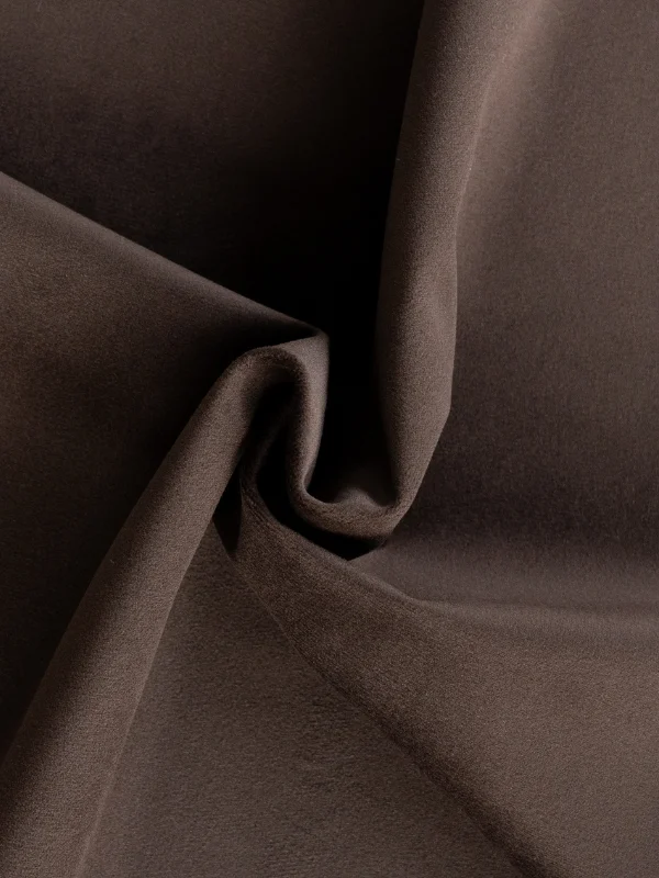
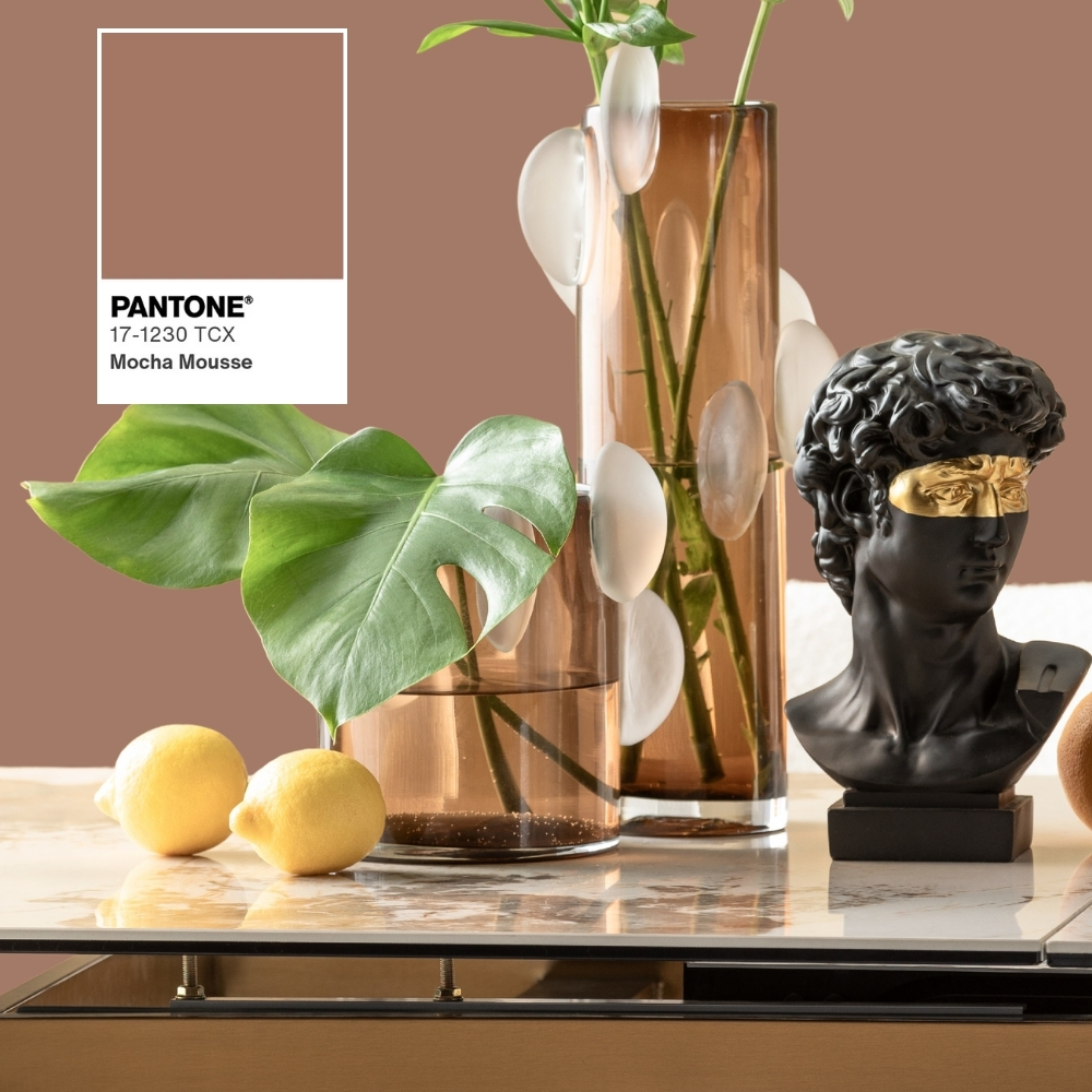
MOCHA MOUSSE 17-1230
Mocha Mousse is the trend color of 2025! It is a rich, chocolate color that exudes both elegance and coziness. This color conveys a sense of warmth and comfort, making it ideal for creating inviting spaces.
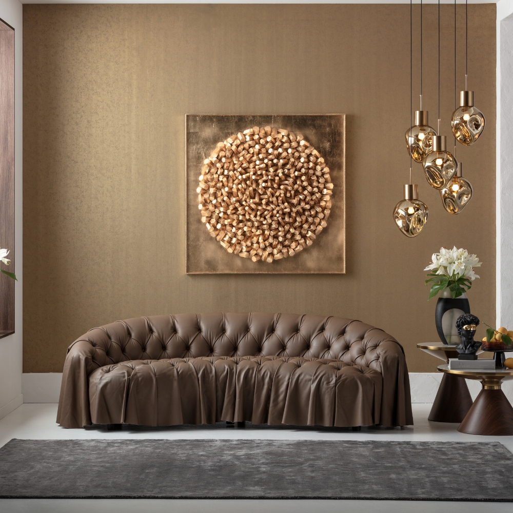
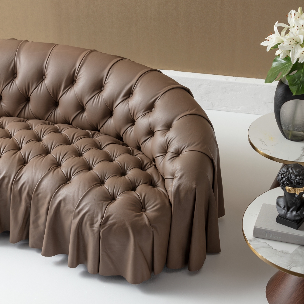
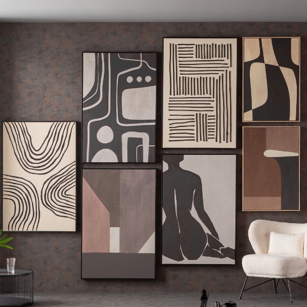
DECORATING WITH THE NEW TREND COLOR
Discover how you can combine KARE furniture with the colour Mocha Mousse and arrange it stylishly to create a harmonious and invigorating atmosphere in your room.


Only 1 available
-18%


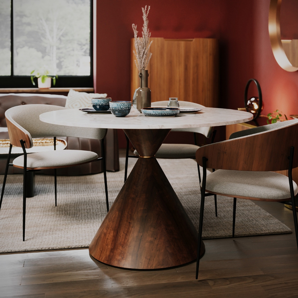
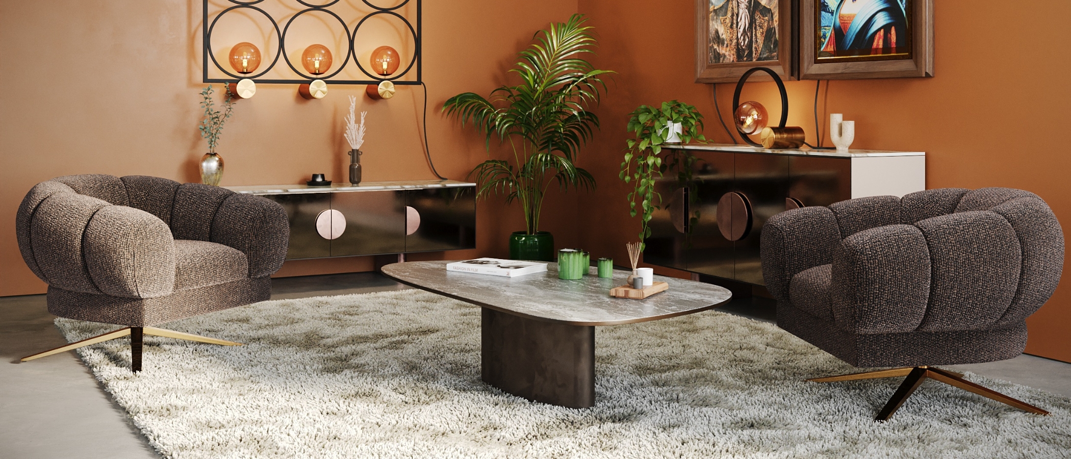
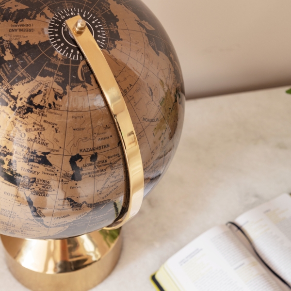
MOCHA MOUSSE: THE COLOR CHARACTERIZES THE MID-CENTURY LOOK


Only 10 available
-18%


Only 10 available
-15%


Only 2 available
-18%


> 99 available
-12%
IN STOCK: 1
Tip


> 99 available
-12%
IN STOCK: >10


> 99 available
-12%
IN STOCK: 2


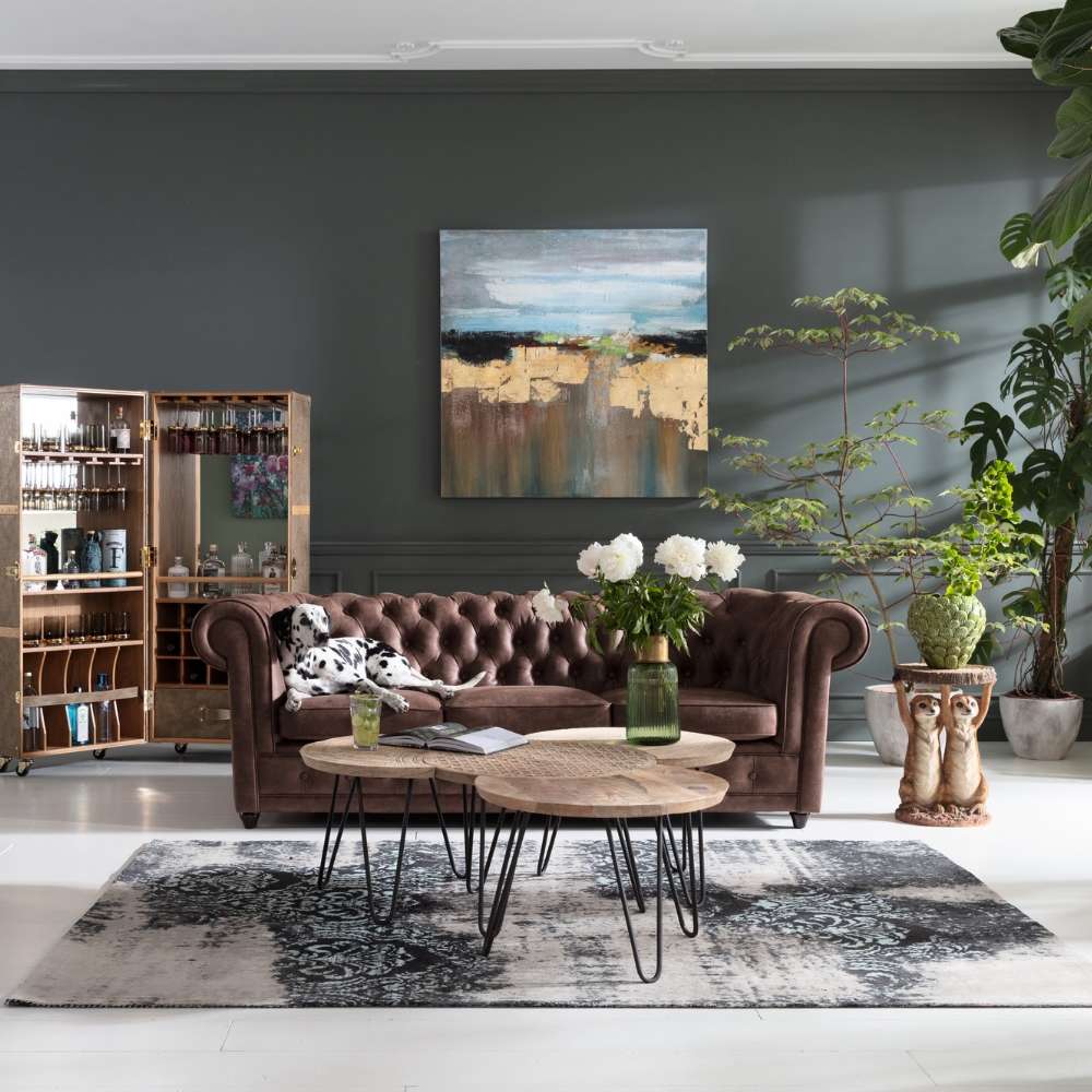
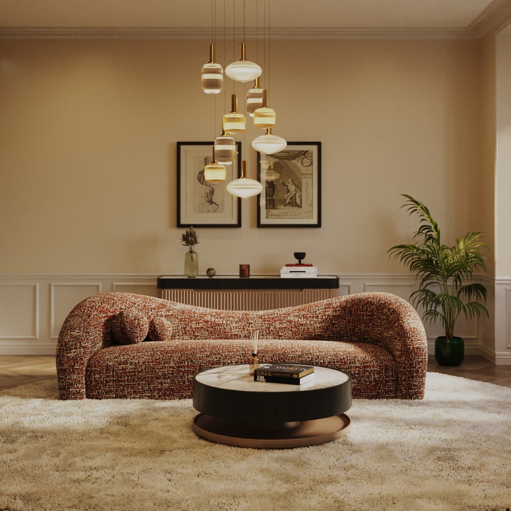
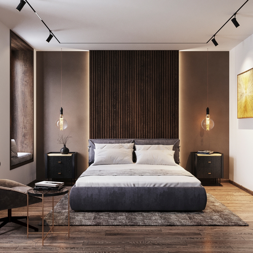
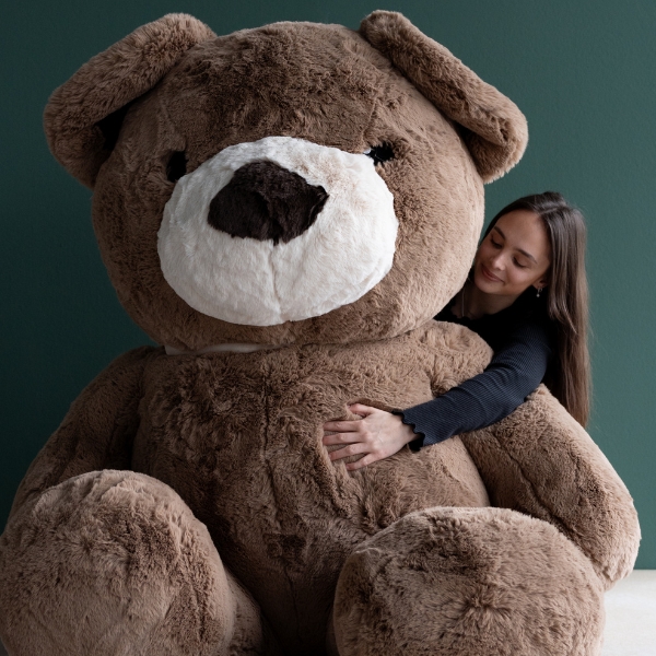
LIVING WITH THE WARMTH OF MOCHA MOUSSE TREND COLOR
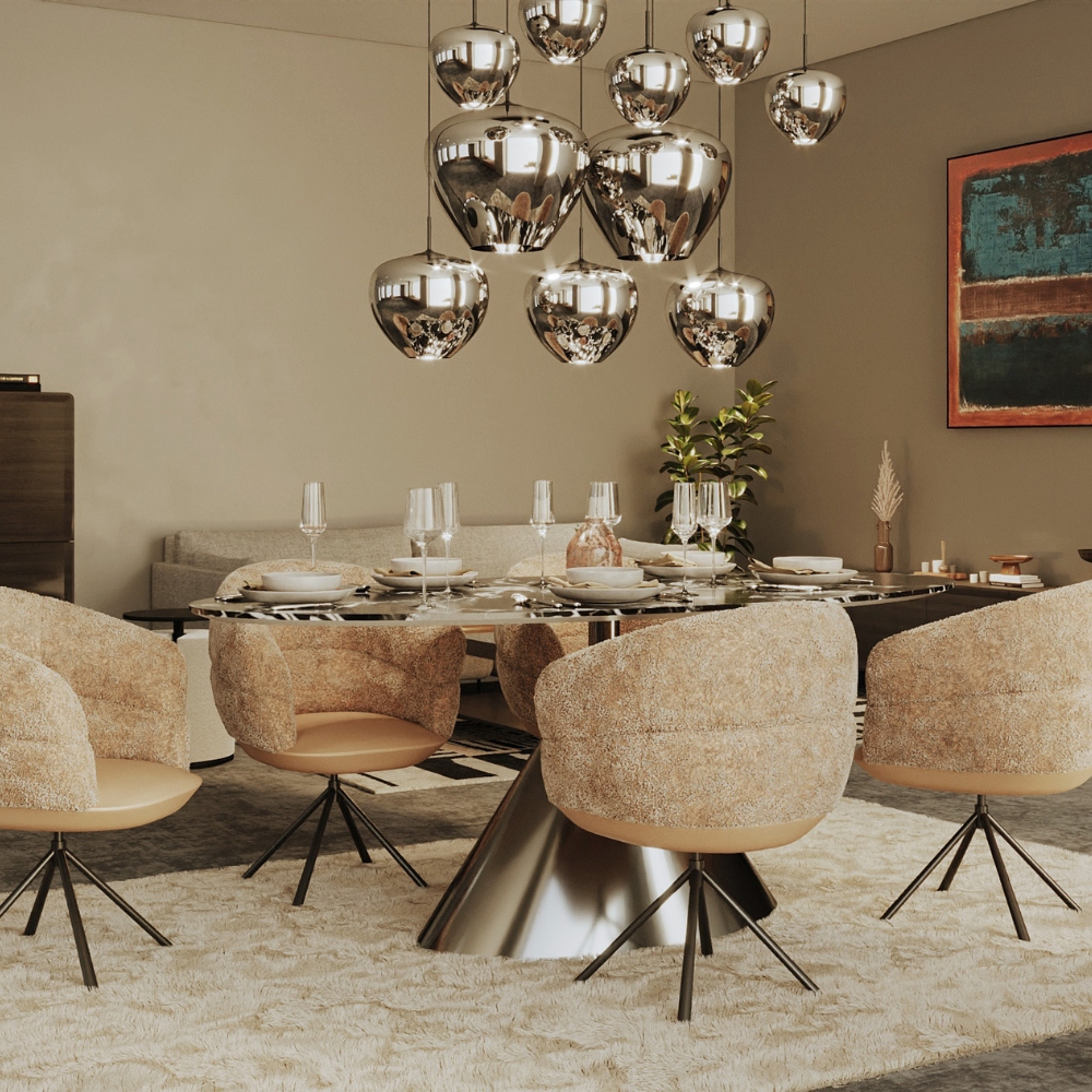
EVEN MORE EYE CANDY IN THE MOCHA MOUSSE LOOK - SIMPLY DELICIOUS
To perfectly round off the warm ambience: decorations and gift ideas that are a delight to look at and to receive.
> 99 available
-12%
IN STOCK: 5
Tip


> 99 available
-12%
IN STOCK: 1
Tip


> 99 available
-12%
IN STOCK: 1


> 99 available
-12%
IN STOCK: 1


Only 1 available
-18%

WE PROUDLY PRESENT - THE 2025 PANTONE TREND COLOR OF THE YEAR IS MOCHA MOUSSE
WHAT IS PANTONE AND WHAT ROLE DOES PANTONE TREND COLOR 2025 MOCHA MOUSSE PLAY IN INTERIOR DESIGN AND FURNITURE SELECTION?
Pantone is an international color system that standardizes colors and makes it possible to communicate colors accurately worldwide. Pantone is often used in the printing industry, graphic design and fashion industry, but also in many other areas, such as furniture and interior design. The Pantone color palette includes thousands of colors, each with a unique number and name.
Pantone Trend Color 2025: Mocha Mousse
Pantone Trend Color 2025 is called Mocha Mousse and is a warm, earthy color reminiscent of chocolate mousse or a creamy coffee touch. This color is a soft but intense brown tone with a hint of red undertone. It radiates warmth, security and sophistication and is versatile enough to enrich both modern and classic interior designs.
Significance of Mocha Mousse for interior design and furniture selection
Calming and elegant atmosphere: Mocha Mousse is a color that conveys warmth and coziness. It is perfect for living spaces where a relaxing yet stylish atmosphere is desired. This color is subtle and not too intrusive, making it ideal for areas such as living rooms, bedrooms or reading nooks.
Versatile combinations: Mocha Mousse combines well with other natural shades, such as beige, sand, grey, olive green or even muted blue. It harmonizes well with wooden surfaces, and furniture in this color brings an organic, harmonious effect to the room. Golden or bronze accents also go wonderfully with this warm, chocolate color.
Reinforcement of textures and materials: This color can be perfectly combined with a variety of materials, especially with natural textures such as wood, leather, wool or linen. Wooden furniture in combination with Mocha Mousse creates a rustic yet sophisticated look. Sofas or chairs made of velvet or leather in this color bring a luxurious yet comfortable feel to the room.
Timelessness and durability: Mocha Mousse is a rather classic and timeless color that will not go out of style quickly. Unlike lighter or trendier colors, which can quickly become outdated, Mocha Mousse has a durability that ensures that furniture in this color will remain modern for years to come.
Warmth and Comfort: This on-trend color aids in creating a cozy, inviting environment. It can be used in furniture such as sofas, armchairs, beds or side tables to create spaces that are both visually appealing and comfortable.
Color Psychology: Brown and earthy tones like Mocha Mousse are often associated with stability, trust, and security. These colors promote a positive atmosphere and can have a calming effect on residents. Mocha Mousse helps make people feel relaxed and welcome in a room.
Conclusion: Mocha Mousse as a Pantone trend color for 2025 brings a mix of modern style and timeless elegance to furniture selection and interior design. It is a perfect choice for anyone looking to create a warm, cozy, yet sophisticated ambiance. Furniture in this color is not only trendy, but also durable and versatile, making it an excellent choice for any home.
HOW IS THE PANTONE TREND COLOUR OF THE YEAR SELECTED?
The Pantone Color of the Year is determined by a careful selection process that takes several months and involves intensive study of global cultural, social, economic and political developments. Here is an overview of the selection process and the factors that play a role in it:
1. Global observations and research
Pantone begins with a comprehensive analysis of global trends. The company examines various industries and cultural trends to understand which colors could play a role. Many different sources are taken into account:
Fashion and design: Pantone follows the latest collections from fashion, furniture and product designers to see which shades dominate the catwalks and stores.
Art and culture: A preference for certain colors often also emerges in art, music, film and literature, reflecting the social climate.
Politics and economics: Pantone also incorporates political events, economic trends and social movements into its color selection, as these often influence color choice and perception.
Technology and innovation: New technologies and the way people interact with digital media also influence color choices.
2. Color as a reaction to social moods
The choice of the Pantone trend color is often a reaction to the collective feelings and mood of the world at a given time. The color is intended to act as a kind of mirror image of the overall cultural atmosphere and express a feeling or attitude that prevails in society.
Example: In the years following the 2008 financial crisis, the soothing turquoise was chosen as the Pantone color of the year in 2010 to symbolize hope and renewal. In 2020, the color Classic Blue was chosen to convey stability and composure in times of uncertainty.
3. The role of the Pantone Color Institute
The Pantone Color Institute is the team of experts that leads the selection process. It consists of a group of designers, color experts and trend analysts who closely monitor the global color and design landscape. They attend color and design fairs, collect data from various fields and study the psychology of color to understand the effect of colors on human behavior and perception.
4. Scientific data and color psychology
Pantone also considers scientific studies on the psychology of color to ensure that the selected color achieves a targeted emotional effect. The impact of color on human behavior is an important part of the selection process because the Color of the Year is often chosen to evoke a specific mood or response, whether it be energized, tranquil, visionary or connected.
5. Announcement and launch
Once the Color of the Year has been selected, Pantone announces the decision publicly – usually in December of the previous year. The color is accompanied by an extensive marketing campaign that emphasizes the color psychology, possible uses and cultural context surrounding this color choice. Pantone often provides color codes that allow designers and manufacturers to reproduce the exact color in their products and designs.
Summary
The Pantone Trend Color of the Year is selected through an extensive process based on global research, cultural observations and the analysis of social trends. Not only the visual aspect of the color plays a role, but also its meaning and effect on people. Pantone incorporates various disciplines such as fashion, art, technology and social movements to select a color that reflects the mood of the times and emphasizes the cultural relevance of the coming year.
WHAT KIND OF COLOR IS MOCHA MOUSSE, ANYWAY?
Mocha Mousse is a warm, earthy color that belongs to the family of browns, but with a special nuance. The exact description of this Pantone Trend Color 2025 is:
Brown with a hint of cream: Mocha Mousse is reminiscent of the color of chocolate mousse, with a warm, velvety brown that can have slightly red undertones, but also creamy, almost beige nuances. This blend of dark and light brown creates a soft, luxurious effect that nevertheless remains down-to-earth and natural.
Warm, soft appeal: Mocha Mousse has a soothing, inviting and cozy appeal. It is not too strong or garish, but rather a tone that blends subtly into its surroundings without being too dominant.
Earthy Associations: The name “Mocha” references coffee, and as such, the hue evokes the warm, rich color of coffee bean skins or dark chocolate. The “Mousse” part references the soft, creamy quality of the color, which has an elegant but unobtrusive charm.
Overall, Mocha Mousse is an elegant, warm and versatile color that can be used in both modern and traditional interiors. It is a true all-rounder that combines perfectly with other earth tones, neutrals and metallic accents.
WHICH FURNITURE AND INTERIOR DESIGN STYLES GO PARTICULARLY WELL WITH THE NEW TREND COLOR MOCHA MOUSSE?
Pantone's 2025 trend color, Mocha Mousse, brings a warm, inviting color into the world of interiors. This soft, earthy brown tone with a hint of cream has the potential to give any room a luxurious yet cozy atmosphere. More than just a trend color, Mocha Mousse is an invitation to create spaces that feel both timeless and modern. This guide will help you understand which furniture and interior styles pair particularly well with this intriguing color.
1. The Scandi-Rustic Mix – Natural Warmth with Minimalist Elegance
Scandinavian style meets rustic accents: the combination of Mocha Mousse and natural materials such as wood, linen and stone creates a room that is both modern and inviting. Furniture made of light, bleached wood, paired with cozy, textile elements in Mocha Mousse, bring a calm, harmonious atmosphere to the room.
Furniture: Choose light wooden shelves, sofas with Mocha Mousse linen covers, or a rustic dining table with a wood grain that accentuates the warmth of the color.
Accents: Complement the look with handmade baskets, woven rugs, or plants that enhance the style's natural charm.
This mix of Nordic design and rustic flair strikes the perfect balance between functionality and comfort, making it ideal for living rooms or bedrooms.
2. The elegant boho style – free-spirited beauty meets warm earth tones
The boho style thrives on individuality, colors and textures. Mocha Mousse complements this style beautifully, embracing the earthy, natural tones of the boho design while adding a sense of calm and elegance. The mix of vintage elements and modern comfort takes on a deeper, more luxurious dimension with the warm brown hue.
Furniture: Mix and match furniture pieces old and new – a velvet or leather Mocha Mousse sofa, for example, with a handcrafted wooden chair or antique brass side table.
Decor: Use boho-style cushions, blankets and rugs in natural shades such as beige, terracotta and olive green to enhance the warm, earthy feel. Macramé wall hangings or colorful, handwoven textiles also harmonize perfectly with the trend color.
The boho style is enhanced by the gentle elegance of Mocha Mousse, without losing its playful and creative energy. This is perfect for living rooms or home offices that need to radiate a cozy yet inspiring atmosphere.
3. Modern Country – Rustic romance with a touch of luxury
Country style is known for its warmth and comfort, and Mocha Mousse brings a modern twist to this classic look. The combination of rustic furniture and the trendy trend color creates an atmosphere that is both contemporary and traditional.
Furniture: Choose furniture made of natural wood or with a vintage look, such as a Mocha Mousse-colored upholstered sofa or a classic country house chair with soft fabric covers. A solid wood table with a matte finish can create an even more inviting effect with the use of Mocha Mousse textiles or accessories.
Decor: Accessories such as metal candle holders, vintage lamps or floral decorations in soft colors complement the warm, natural ambience. Curtains or rugs in Mocha Mousse complete the look and add an extra sense of comfort.
This style is perfect for country houses, but also for urban apartments that want to maintain a rural, cozy atmosphere.
4. Contemporary elegance – minimalism meets luxury
For those who love minimalism or modern elegance, Mocha Mousse is an excellent choice for combining simple, clean lines and cool materials with a touch of luxury and warmth. The color is ideal for modern furniture that is less playful but all the more sophisticated.
Furniture: Choose clean, geometric pieces – a minimalist sofa or a modern glass and metal coffee table – and liven them up with cushions and textiles in Mocha Mousse. An elegant contemporary chair in this shade can serve as a statement piece in an open room.
Accents: Use shiny surfaces such as stainless steel or chrome, as well as modern artwork characterized by abstracted forms and subtle hues. Mocha Mousse can serve as a soothing color here, underscoring the simplicity and luxurious ambience.
This style works particularly well in urban apartments, lofts or modern houses where functionality and aesthetic demands need to be reconciled.
5. Mid-century modern style – retro meets timeless elegance
Mid-century modern style is known for its clean lines, functionality, and simultaneously elegant retro look. Mocha Mousse harmonizes beautifully with the warm, earthy color palette of this style and brings added depth to the iconic furniture.
Furniture: A mid-century sofa in Mocha Mousse, combined with wooden legs and clean, geometric shapes, is the perfect place to start. Complete the room with functional pieces of furniture such as an elegant desk or a walnut side table.
Accents: Decorative elements made of copper, brass or even marble bring out the luxury and sophistication of the mid-century style. Artistic wall mirrors and minimalist artwork are also perfect matches.
This style is perfect for urban living or for people who want a mix of retro charm and timeless elegance.
Conclusion:
Mocha Mousse is not just a trendy color, but a color that works in many different interior styles. From boho and country house to minimalist-modern design – Mocha Mousse offers endless possibilities for bringing warmth, sophistication and coziness into your rooms. Choose furniture that integrates natural materials and clean lines to skillfully showcase this trendy color and create a space that is both timeless and inspiring.
WHICH DECORATIVE ELEMENTS AND OBJECTS CAN BE PARTICULARLY WELL COMBINED WITH THE PANTONE COLOR MOCHA MOUSSE?
Pantone's Mocha Mousse color is a warm, earthy brown shade with a hint of cream that creates a harmonious and cozy atmosphere in many different interior design styles. When you incorporate this color into your space, you can enhance its warm, inviting effect with the right selection of decorative elements and objects. Here are some decorating ideas that go perfectly with Mocha Mousse:
1. Wood and natural materials
The warm, earthy color of Mocha Mousse harmonizes beautifully with natural materials. Wood and other natural materials enhance the relaxed and down-to-earth effect of the color while adding texture and depth to the room.
• Wooden frames for mirrors or pictures
• Rattan or wickerwork for storage baskets, chairs or wall shelves
Wooden sculptures or small pieces of furniture made of solid wood, such as side tables or decorative shelves
Cork or bamboo accessories for an environmentally conscious touch
2. Metallic accents (gold, copper, brass)
Metallic shades such as gold, copper and brass add a touch of luxury and combine well with Mocha Mousse. These colors contrast beautifully with the earthy tones of Mocha Mousse, adding both glamour and warmth to the room.
Golden or brass-colored lamps – table or floor lamps with a modern design
Copper decorative objects such as vases, candle holders or small sculptures
Metal picture frames or desk accessories
3. Textiles in natural tones and accent colors
Textiles play an important role in interior design and are one of the easiest ways to incorporate color and texture. Mocha Mousse goes particularly well with natural tones and accent colors, which emphasize the warm ambiance.
• Pillowcases and blankets made of linen or wool in muted earth tones such as beige, sand, terracotta or olive green
Carpets made of jute, sisal or wool in natural colors that harmoniously complement the floor surface
Curtains made of heavy fabrics such as velvet or cotton in Mocha Mousse or contrasting colors such as warm gray, blue or rust red
4. Leather and fabrics
Leather in warm brown tones or soft fabrics go wonderfully with Mocha Mousse to create a cozy and luxurious atmosphere. Furniture and accessories made of leather go particularly well in this room and add a touch of sophistication.
Leather cushions in soft brown tones or in a darker shade to enhance the contrast
Leather chair or stool as a functional and stylish addition to a sofa in Mocha Mousse
Leather or fabric drapes for curtains or furniture covers
5. Plants and green tones
Plants are not only a natural eye-catcher, but also set accents in a room. Mocha Mousse is perfect for bringing out the green tones of plants.
Green house plants such as ficus, ivy or succulents, whose fresh green contrasts beautifully with the warm color of Mocha Mousse
Flower pots made of terracotta, concrete or ceramic, which enhance the rustic charm of the color
Vertical gardens or plant troughs made of wood or metal for added texture
6. Candles and light sources
Candles are an easy way to create a warm atmosphere. The soft color of Mocha Mousse can be further enhanced by the right light.
Candles in shades of mocha or beige in elegant metal or wooden candle holders
Tealight holders and lamps in warm tones that harmonize with the earthy tones of Mocha Mousse
String lights or LED lights for subtle lighting effects that make the room cozy
7. Artwork and wall decorations
Artwork and wall decorations in coordinating shades can complement a Mocha Mousse room perfectly. Choose paintings or sculptures that make the color a focal point or gently emphasize it.
Abstract paintings or photographs with warm browns, earth tones or even golden highlights
Wall mirrors with wooden or metal frames to visually enlarge the room and reflect the warmth of Mocha Mousse
Macramé wall hangings or elaborate tapestries that add texture and interest
8. Glass and ceramic objects
Decorative objects made of glass or ceramic can enhance the soft, soothing feel of Mocha Mousse, especially if they are in clear or milky tones.
• Vases made of frosted glass or ceramics in matte, neutral shades
• Bowls and plates made of ceramic or glass that serve as practical and decorative elements
Decorative glass bottles or ceramic figures that subtly adorn the room
Conclusion:
The Pantone trend color Mocha Mousse can be combined in many ways and offers numerous possibilities for harmoniously designing your rooms. By choosing the right decorative elements – whether they are made of wood, metal, textiles or plants – you can further enhance the warm, inviting radiance of this color. Combine natural materials, warm metallic accents and soft textiles to create an atmosphere that is both cozy and stylish.
IS THE PANTONE TREND COLOR A TIMELESS CLASSIC OR JUST A SHORT-LIVED TREND?
The Pantone Color of the Year for 2025, Mocha Mousse, is a color that combines both timeless and trend-forward characteristics. Here are a few thoughts on why it can be considered both a classic and a trend:
Timelessness of Mocha Mousse
Mocha Mousse is a warm, earthy brown tone with a hint of cream that appears subtle and elegant at first glance. It belongs to the color family of earth tones, which are recurring in interior design and never really go out of style. It can be easily integrated into a variety of room concepts and has a calming and cozy effect that is appreciated in many different eras and cultures.
Earth tones are classic colors: shades of brown remain one of the most popular and frequently used color groups in interior design because they create a natural, stable and calming atmosphere. Shades like Mocha Mousse go well with almost any interior and can be used in various combinations with wood, metal or fabrics.
Versatility and adaptability: Mocha Mousse can be combined with many other colors, making it a very flexible choice for furniture and decoration. It works well in both modern and traditional interiors, in rural and urban environments. This means that it can be a stylish color for years to come without looking outdated.
Mocha Mousse trendiness
Although Mocha Mousse has a certain timelessness, it has been chosen as a trend color for 2025 by Pantone, suggesting that it will be in focus and play a more prominent role in the design world in the coming year. Pantone trend colors are often a reflection of the current social mood or cultural development, and mocha mousse could be seen as a reaction to our need for comfort, stability and warmth in uncertain times.
Annual trends: Pantone selects its trend color each year based on various factors such as cultural, political and economic events, as well as social trends. It is therefore likely that Mocha Mousse will remain popular as a trendy, “inspired” color in the coming years, but will not permanently achieve the status of an everlasting classic color.
Modern return to natural colors: In recent years, there has been a return to natural, earthy colors that reflect a need for calm and connection with nature. This development could help ensure that Mocha Mousse lasts longer than just a passing trend in interior design and furniture design.
Conclusion: a mixture of both
In many respects, Mocha Mousse is a timeless classic in terms of color palette choices. It belongs to the family of earth tones that never go completely out of style. At the same time, this particular shade will be highlighted in the coming years by its selection as the Pantone Trend Color for 2025 and could therefore appear as a trend-conscious color in interior design. If you choose furniture or decorations in Mocha Mousse, you can be sure that this color will achieve a timeless, stylish effect both now and in the long term.
A BRIEF OVERVIEW – WHAT WERE THE PANTONE TREND COLORS OF RECENT YEARS?
Here is an overview of the Pantone trend colors from recent years. These colors are chosen by Pantone each year to reflect the mood and cultural trends and often influence fashion, design and interior trends:
Pantone Trend Color 2024: “Apricot Crush”
A soft, warm yellow-orange shade that radiates optimism, energy and joie de vivre. ‘Apricot Crush’ symbolizes the desire for positive, vibrant moments.
Pantone Trend Color 2023: ”Viva Magenta”
A strong, vibrant red that radiates energy, courage and joy. This color is based on the red tones of cochineal, a natural dye, and emphasizes the importance of self-confidence and determination.
Pantone Trend Color 2022: “Very Peri”
A vibrant, blue-purple periwinkle that embodies creativity, renewal and transformation. It symbolized the transition to a new era and stood for adaptability to change in an ever-changing world.
Pantone Trend Color 2021: “Ultimate Gray” and “Illuminating” (Yellow)
This year, Pantone chose two colors that together symbolized a combination of stability (Ultimate Gray) and hope (Illuminating Yellow). These colors reflected the need for resilience and optimism in a challenging time.
Pantone Trend Color 2020: “Classic Blue”
A soothing, deep blue that stands for stability, trust and serenity. It was a color that indicated confidence and clarity and conveyed a sense of calm in a year of uncertainty.
Pantone Trend Color 2019: “Living Coral”
A vibrant, warm coral red with golden undertones, associated with joie de vivre and optimism. It embodies a life-affirming, cheerful attitude and a connection to nature.
Pantone Trend Color 2018: “Ultra Violet”
A strong, deep violet that symbolized creativity, originality and vision. It combined spirituality with a forward-looking perspective and inspired new ways of thinking.
Pantone Trend Color 2017: “Greenery”
A fresh, vibrant green-yellow that emphasized hope and connection to nature. It stood for new beginnings and vitality, and reflected the desire for a more conscious life and sustainability.
Pantone Trend Colors 2016: “Rose Quartz” and “Serenity”
Two colors were chosen this year: a soft pink and a soothing blue, which together symbolized calm and serenity. They stood for balance between body and mind.
Pantone Trend Color 2015: “Marsala”
An earthy, strong wine red that stood for warmth, elegance and a down-to-earth attitude. Marsala was described as a color that was both familiar and surprising, and spoke to connection and authenticity.
These colors show how the Pantone selection in recent years has increasingly focused on social issues such as optimism, resilience, creativity and closeness to nature. They reflect the respective times and influence various design areas, from fashion to interior design to graphic and product design.


Only 1 available
-18%

Only 2 available
-40%
IN STOCK: 1


Only 2 available
-18%


> 99 available
-12%
IN STOCK: 1
> 99 available
-12%
IN STOCK: 1
Only 10 available
-15%

> 99 available
-12%
IN STOCK: 1
Tip
Only 1 available
-40%
IN STOCK: 1


Only 10 available
-18%


Only 3 available
-18%

> 99 available
-12%
IN STOCK: 1
Tip
> 99 available
-12%
IN STOCK: 2


Only 6 available
-18%


Only 5 available
-18%


> 99 available
-12%
IN STOCK: 5
Tip


Only 4 available
-18%


Only 1 available
-18%


Only 2 available
-18%


Only 5 available
-18%


Only 1 available
-18%


Only 2 available
-18%
IN STOCK: 2

x80cm")